


LINE WEIGHT IN DESIGN SKETCHING
27 October, 2023
BY TONIA YAU
Concept art is all about visually communicating ideas. Whether this be to clients, art directors, or other artists within the production team. Line work drawing is an efficient and concise way of expressing design solutions, especially when it comes to grasping 3d form. It is therefore important for us to understand the importance of line weight and each lines’ intention. Not only can this help us achieve a high level of finishing in our drawings, it will also allow you to explore different art styles.
Comics and manga are great examples of artists pushing the use of line. Looking at these examples of line work in manga, a lot of the art style alone lies in line weight treatment!

In order to accomplish consistent line work, we must create a system for ourselves known as ‘line weight hierarchy’. This means that different thickness in lines corresponds to a certain purpose or objective. Remember: every line you make on the page should have an intention! Every artist might have a different set of rules they adhere to, which in turn becomes their art style. However, if you are just starting out we recommend a simple 1,2,3 framework you can follow to achieve logical and cohesive line work:
1. Thick lines can be used to express outlines of silhouettes,
overlapping of objects, or to emphasise areas of shadow
and ambient occlusion (absence of light).

2. Medium lines can be used as overall expression of form or
contour inside an object, these can also be your ‘normal line
thickness’ in which you reference other line weights against.

3. Thin lines are used to delineate small details and texture such
as hatching or shading. These should have a large contrast
compared to your thickest lines.

LINE WEIGHT DEMO
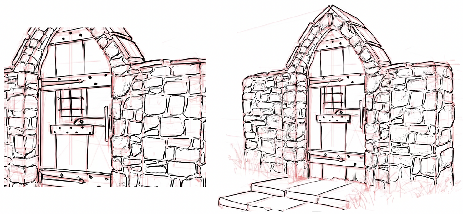
This is a quick observational drawing I have done using references of an ancient gate. Usually I like to tweak the perspective to a 3/4 view which shows more 3d form and dynamism. My goal for this exercise is to capture all the lovely aging and weathering details found in the rich materiality of this abandoned structure. First, I sketch loosely to grasp the general proportions and perspective of the subject matter. At this point I am also thinking about where my primary focal point will be to start the final line work.


REFRENCE INITIAL SKETCH
MEDIUM LINE WEIGHT

I begin at my primary focal point (being the wooden door itself), using my medium/normal line weight to capture the basic form.
I do this until most of the largest elements like the door, stone bricks, and staircase have been defined. This way I have less stress as I know the bulk of the drawing has already been filled out.
THIN LINE WEIGHT
Next, I use my thinnest line weight to add some texturing details to show the wood and stone’s unique materiality. You can use broken, dotted lines, tapered lines, or even shading to express these details. Have fun with it!
By starting at the focal point, I can slowly transition out the detail density to less important areas and edges of the drawing. This way we are able to conserve our energy yet put our best efforts in the parts of the drawing that will be most impactful on first read.
THICK LINE WEIGHT

I then use my thickest line weight to create some punchy contrast. I often will outline areas of overlap, borders of certain elements, or even block in opaque areas of shadow to add more understanding of the light source.
Adding hatching or shading to certain faces can also help define planes and give a better idea of the object in 3d space. Think of the eraser tool as a brush in and of itself. You can use it to carve out shapes and create interesting textures!
TRY IT OUT FOR YOURSELF!

Design sketching is never a one way workflow. I will always oscillate between my thin lines, thick lines, then go back to refine more of the details, adding more outlines, rechecking my reference. It is an iterative process, there is no right or wrong way.
I hope these tips on line weight allowed you to gain more confidence in drawing, especially when executing a finished look.
Happy sketching!
Related Posts
SPEAK TO AN ADVISOR
Need guidance or course recommendations? Let us help!